
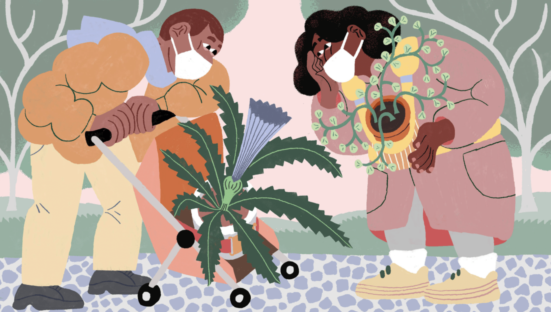
Providing assurance by personalising the e-commerce experience
Role
Co-lead UX
UI Designer
team
Natalie Orsos
Dotti Li
Ava Vlahogianis
timeline
2 week sprint
Feb 2023

Overview
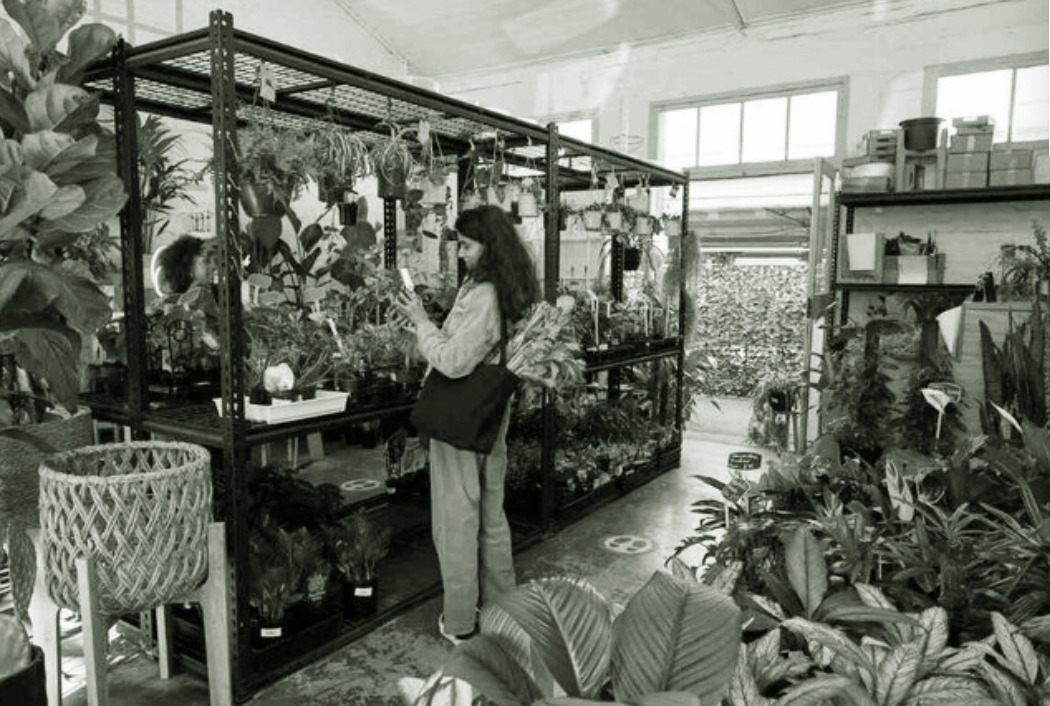
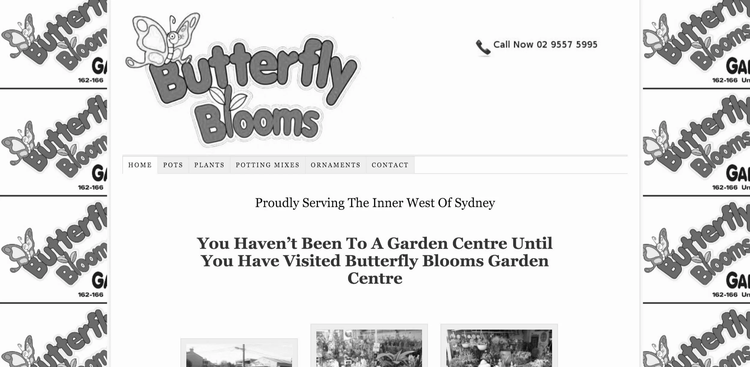
With over 30 years of experience, Butterfly Blooms is a local plant nursery with a strong physical presence but without any e-commerce offering. As part of an intensive design course, our team was tasked to give a visual refresh of Butterfly Blooms website. Our challenge was to find a way to translate the visual cues and support typically received in-person onto an e-commerce platform.
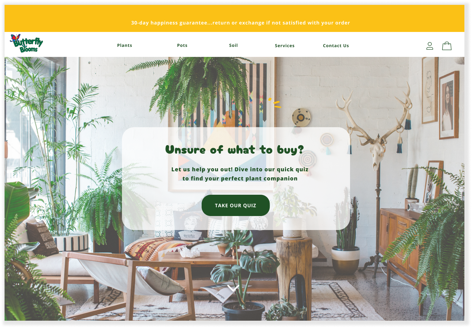
The solution is a friendly and playful e-commerce interface with a quiz feature. The visual prompts and curated list of plant suggestions simplifies the shopping experience whilst providing guidance and reassurance to new plant buyers.
OUR RESEARCH & DESIGN PROCESS
Persona
Ideating
Prototype & Testing
Visual Design & Branding
Iterate & Reflect
User Interviews
Market Research
PROJECT GOALS

To develop the current website to include an e-commerce offering

Provide a visual refresh whilst maintaining its brand image of a ‘small local shop’

To have their e-commerce site complement their personable in-store customer service experience

To differentiate from large competitors through curated ‘hand-picked quality’ products over quantity
MARKET RESEARCH
let’s first investigate some market trends…
we found that:
Millennials were the biggest demographic growth in 2021 houseplant sales at 65%
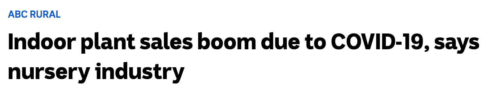
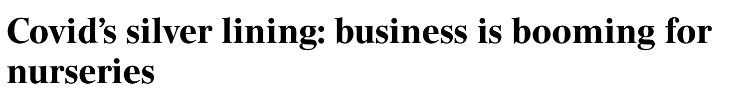
Indoor plant sales increased by over 20% over COVID, particularly easy-to-care, low-maintenance plants.
The mental and physical benefits of gardening were key to the pandemic boom
there was opportunity to target low and/or high knowledge plant buyers
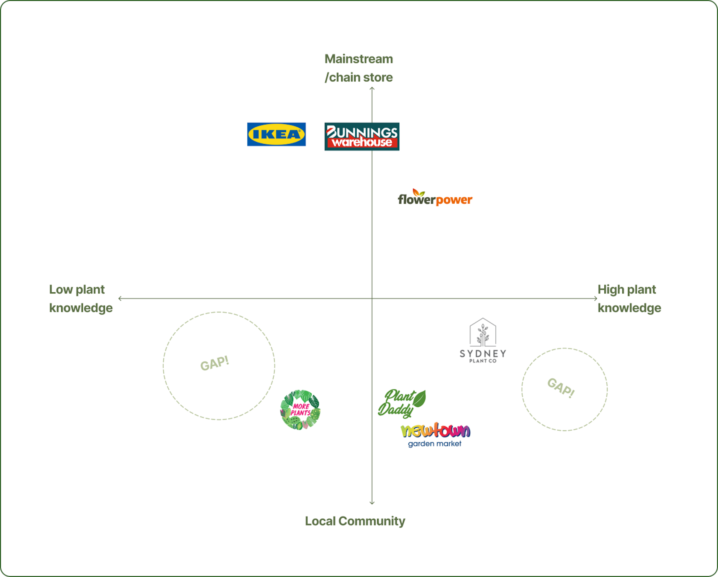
Whilst Butterfly Blooms have found success in their local brick-and-mortar store, this doesn’t necessarily translate online. To identify possible gaps and opportunities in the market, we analysed Butterfly Blooms local competitors.
we found that:
6/7 competitors targeted customers with ‘moderate’ plant knowledge.
We saw there was a gap & therefore opportunity to target low plant and/or high knowledge buyers. Even so, we needed to validate this through primary research i.e. user interviews.
USER INTERVIEWS
interviewing 36 customers & 8 staff instore and online
To better understand our customers, we interviewed potential users through zoom, phone calls and in-person visits to 8 nursery stores asking questions like:
“What was your last plant purchase & Why?
“ How did you decide what you were going to buy?
“ Can you walk me through the process of purchasing your plant?”
We synthesised these findings through affinity mapping, analysing and categorising insights with the goal of identifying the main needs, wants & frustrations plant buyers experienced.
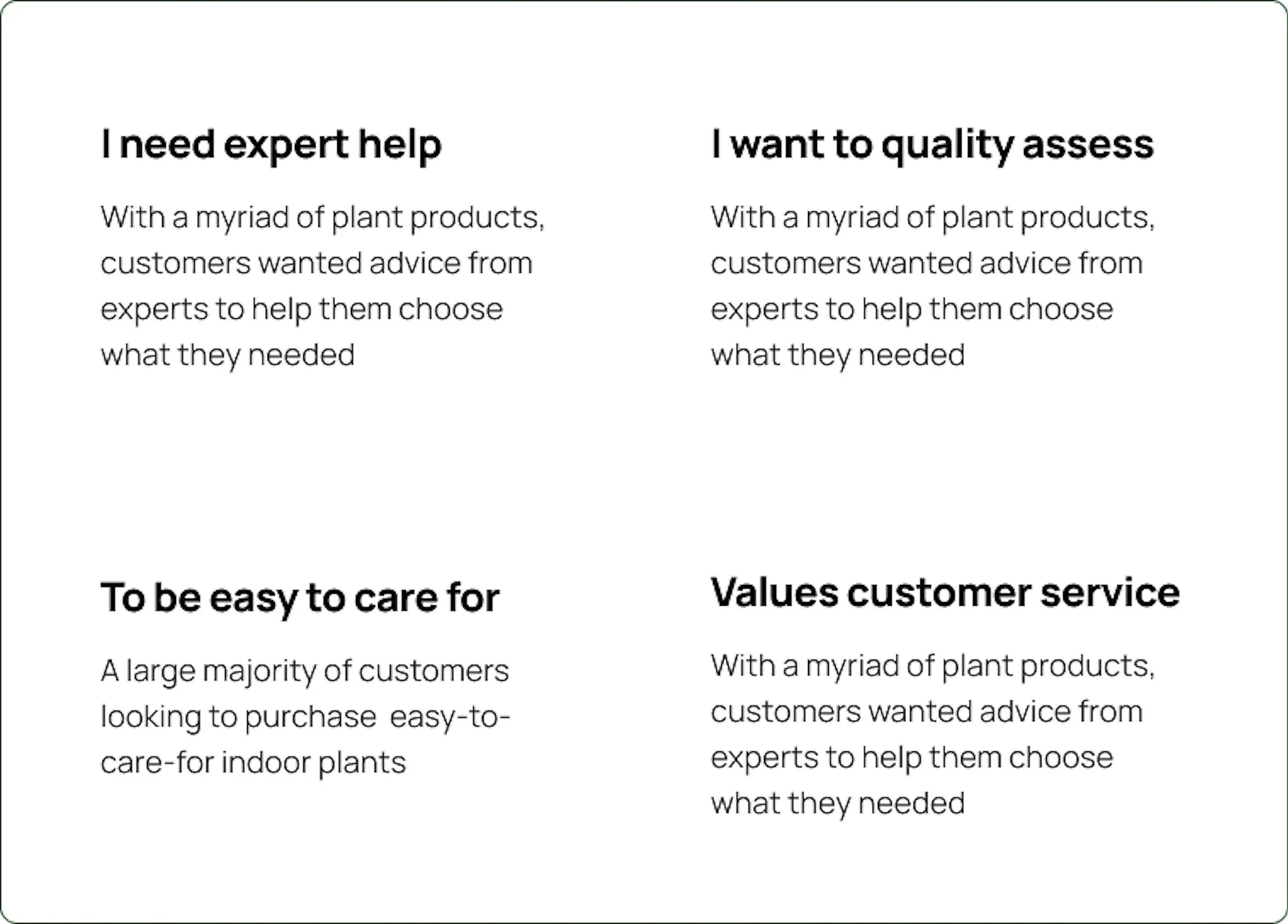
the interview’s revealed 4 key insights
PERSONA
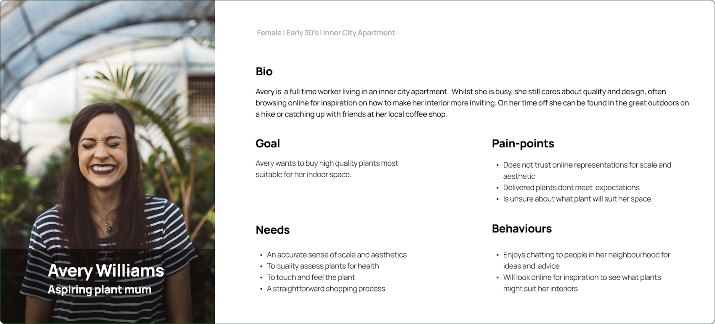
introducing Avery
“I want to bring the outside in”
As an aspiring plant mum, Avery is looking for quality plants to suit her inner city apartment. She browses her local nursery website for inspiration but is hesitant to purchase online as she is unable to accurately visualise or quality assess the plant. She resorts to going in store for advice and for assurance.
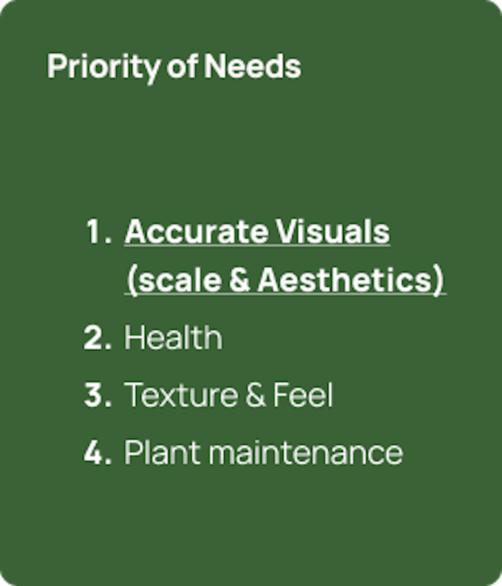
we agreed accurate visuals was the most important need to solve for
Whilst we wanted to solve for all of our Avery’s needs, we recognised this was not feasible and that it was more effective to solve for one need at a time.
Referring to our persona, we assessed that solving for an accurate visual representation of scale and aesthetics would add the most value to Avery and be more feasible to solve for online compared to texture and feel.
PROBLEM STATEMENT
Avery needs a way to accurately visualize the scale of plants in order to feel assured she is buying the most suitable plant for her home
IDEATING
How might we … accurately visualise scale? add certainty?understand her apartment space?
We kicked off the ideation phase by reframing our ploblem statement into three ‘How Might We?’ statements to help us quickly generate ideas.
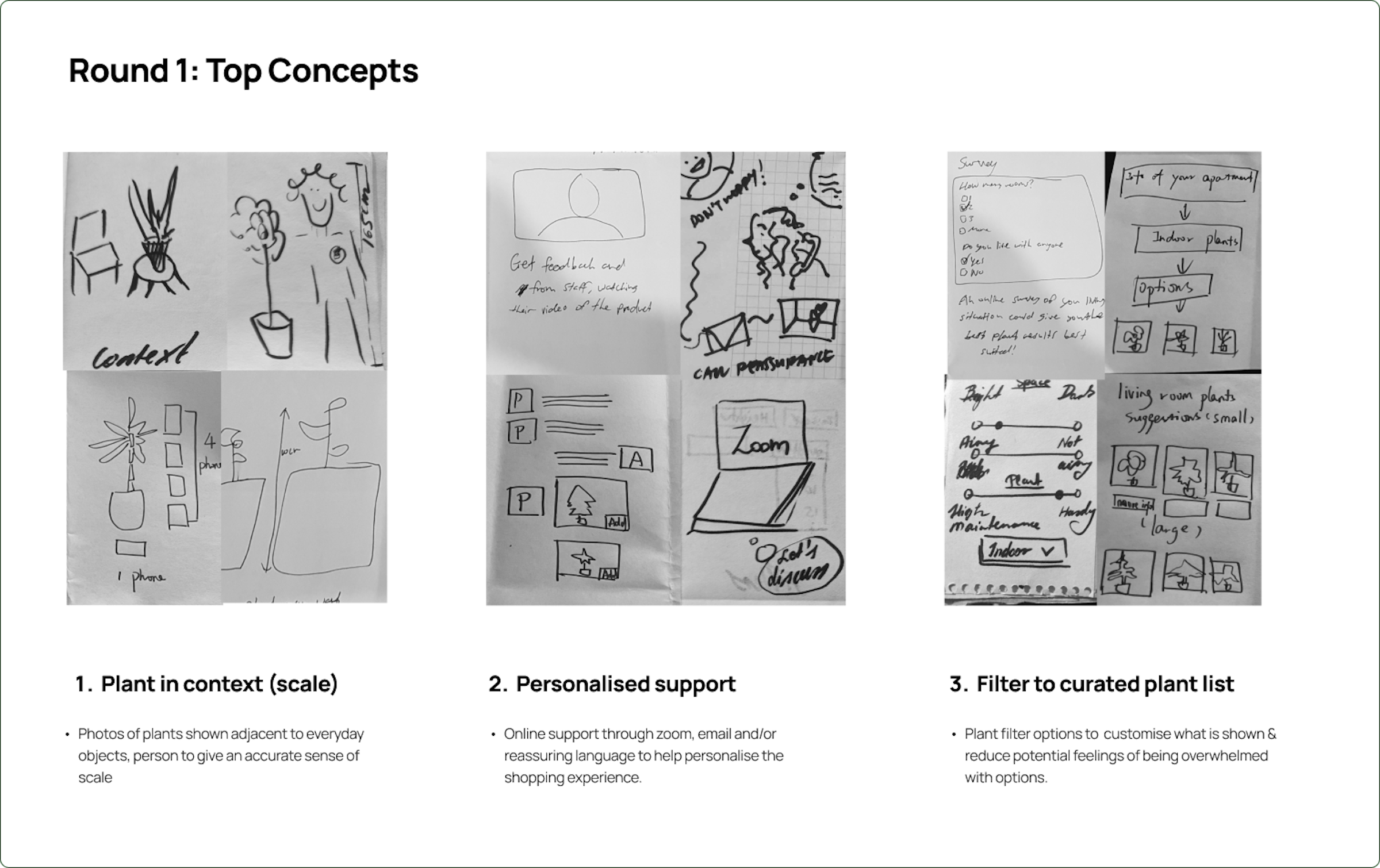
We assessed that a visual plant quiz would add the most value to the user and be feasible to implement
Based on a criteria of feasibility, impact & value we assessed that:
Visual Plant quiz: We agreed that this idea would add the most user value and was the most feasible to implement.
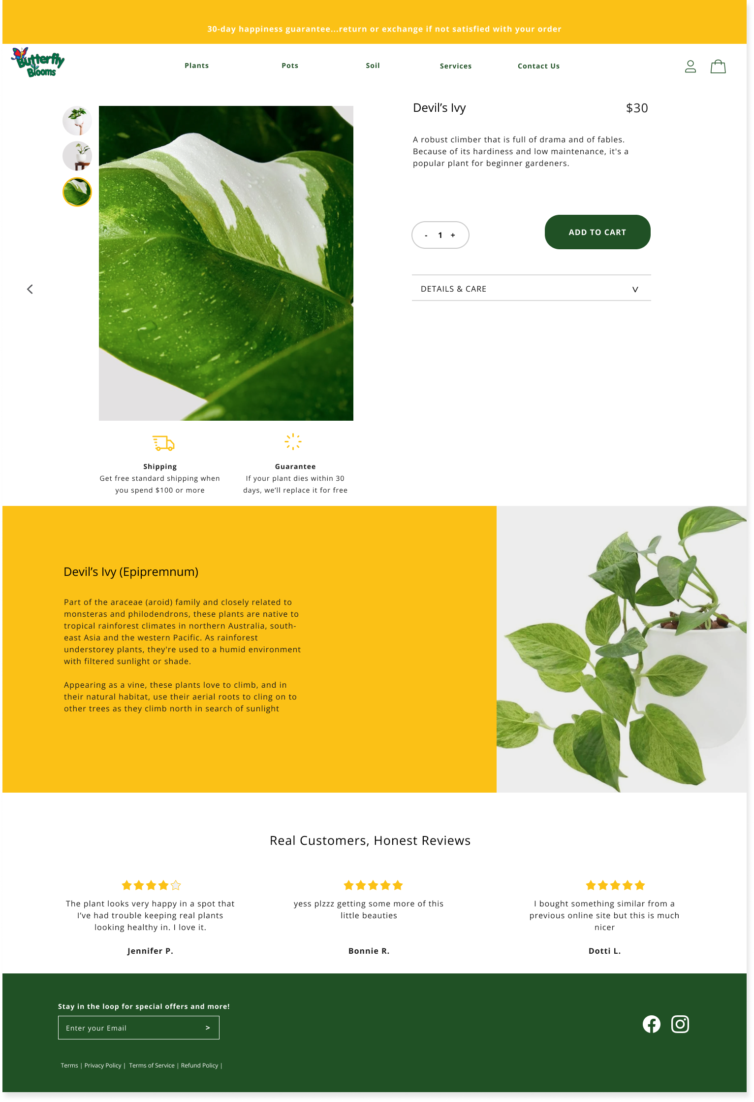
Scaled plant images feature: This idea was feasible but not that impactful. Our research identified other competitors were already doing this to varying success. We assessed this could be an easy-to-implement additional feature that would enhance the shopping exp.
Plant showroom: This idea whilst impressive and impactful would not be cost-effective for a small local business.
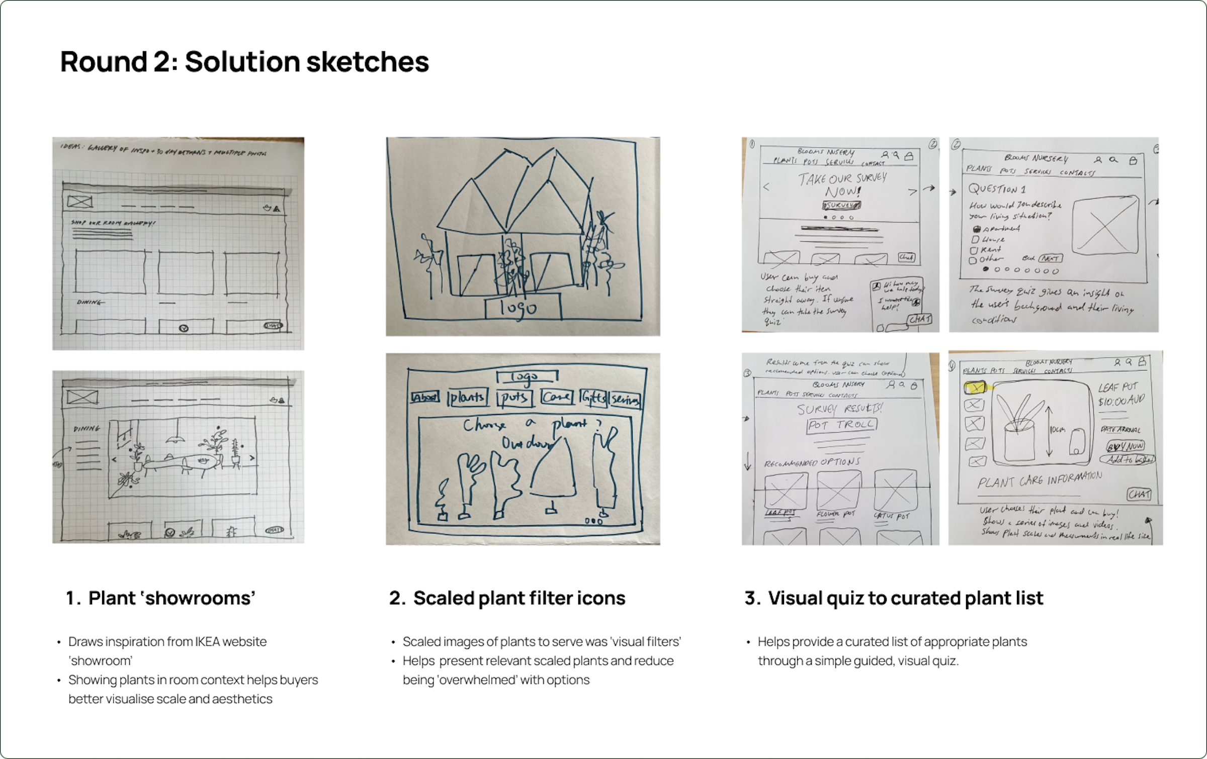
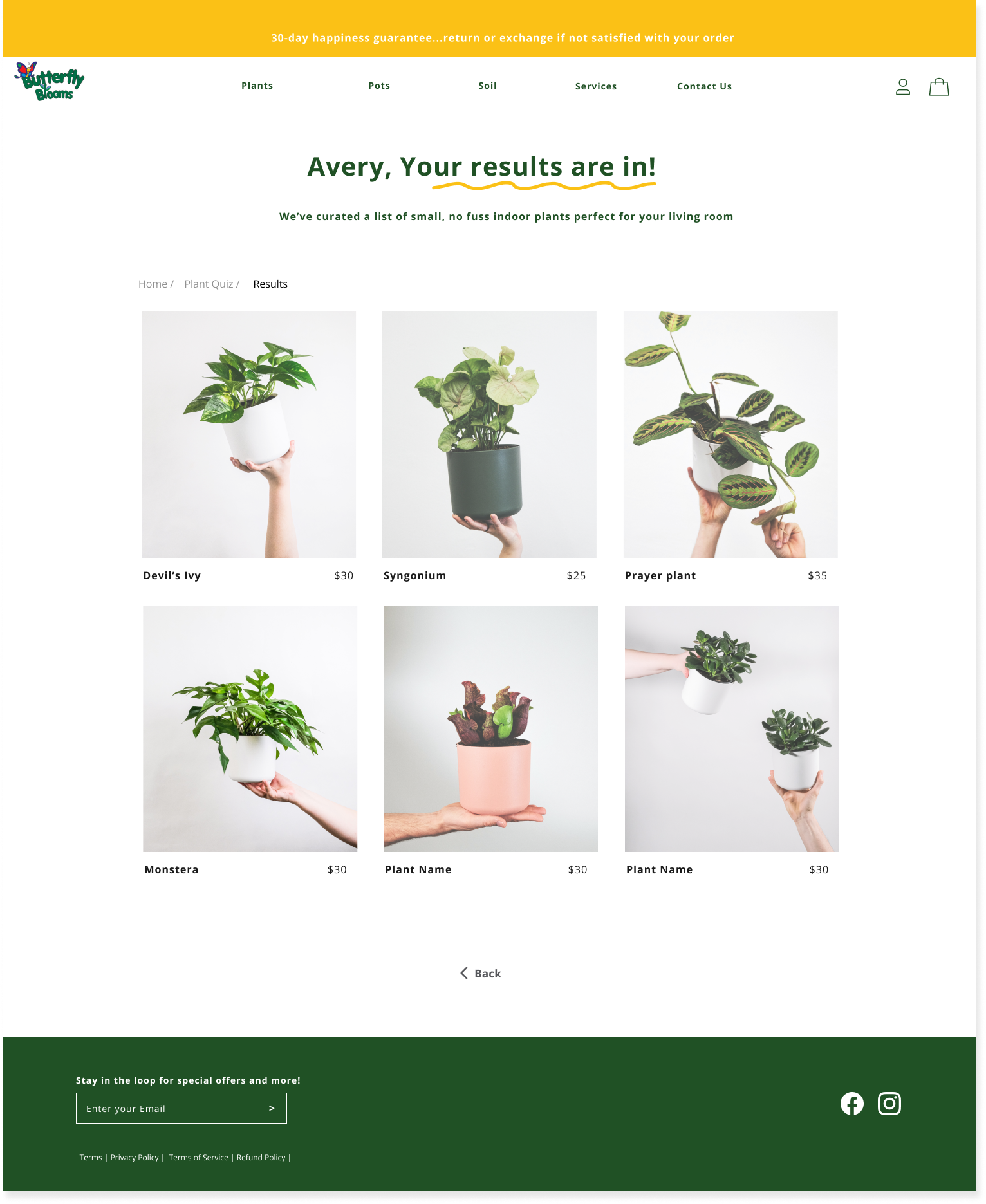
WINNING IDEA
A ‘visual pop quiz’ feature that led to a curated plant list
We hypothesized: The interactive quiz with accompanying images would help Avery visualise the scale of the plant (amongst other filter options). Furthermore, the personalized results would translate the guided assistance typically received in-store and help Avery feel more assured to purchase online.
SUPPORTING RESEAERCH
quizzes created a customized experience that increased conversion rates
To further assess the validity of our idea, we combed through Business studies, articles & research papers.
They revealed that:
When there were too many product options, customers often felt overwhelmed and dropped off - they needed a way to filter through products.
E-commerce stores utilizing an interactive ‘quiz’ had increased Conversion Rate (CVR) i.e. NatureWise, a supplement brand, has a 25% CVR in their quizzes.
Quizs helped produce accurate product recommendations that influenced users’ purchase decisions.
implementing best practices from other e-commerce quiz’s
With supporting research behind our idea we wanted to understand how other e-commerce websites (matcha drink, hair product, pet food, plant stores) built their quiz feature. This would help us translate copy & content best practices into our prototype.
Our findings revealed:
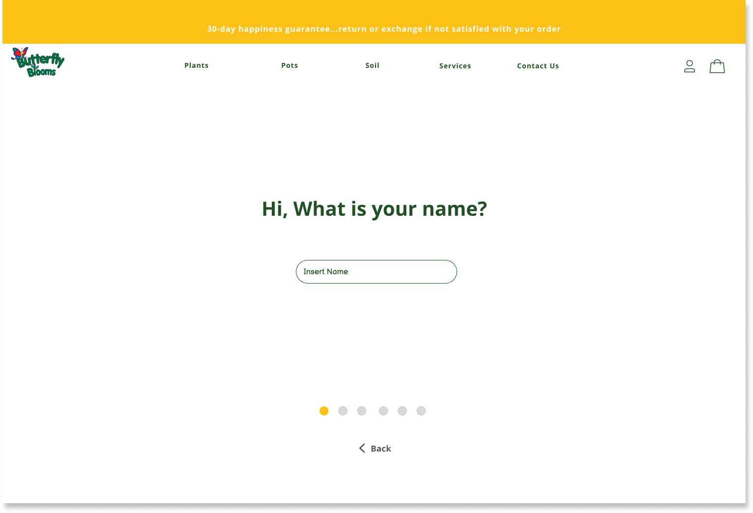
4/4 websites used progress bars or paginations
4/4 websites had short and concise questions/answers
4/4 websites used casual & friendly copy
3/4 websites used accompanying images and infographics
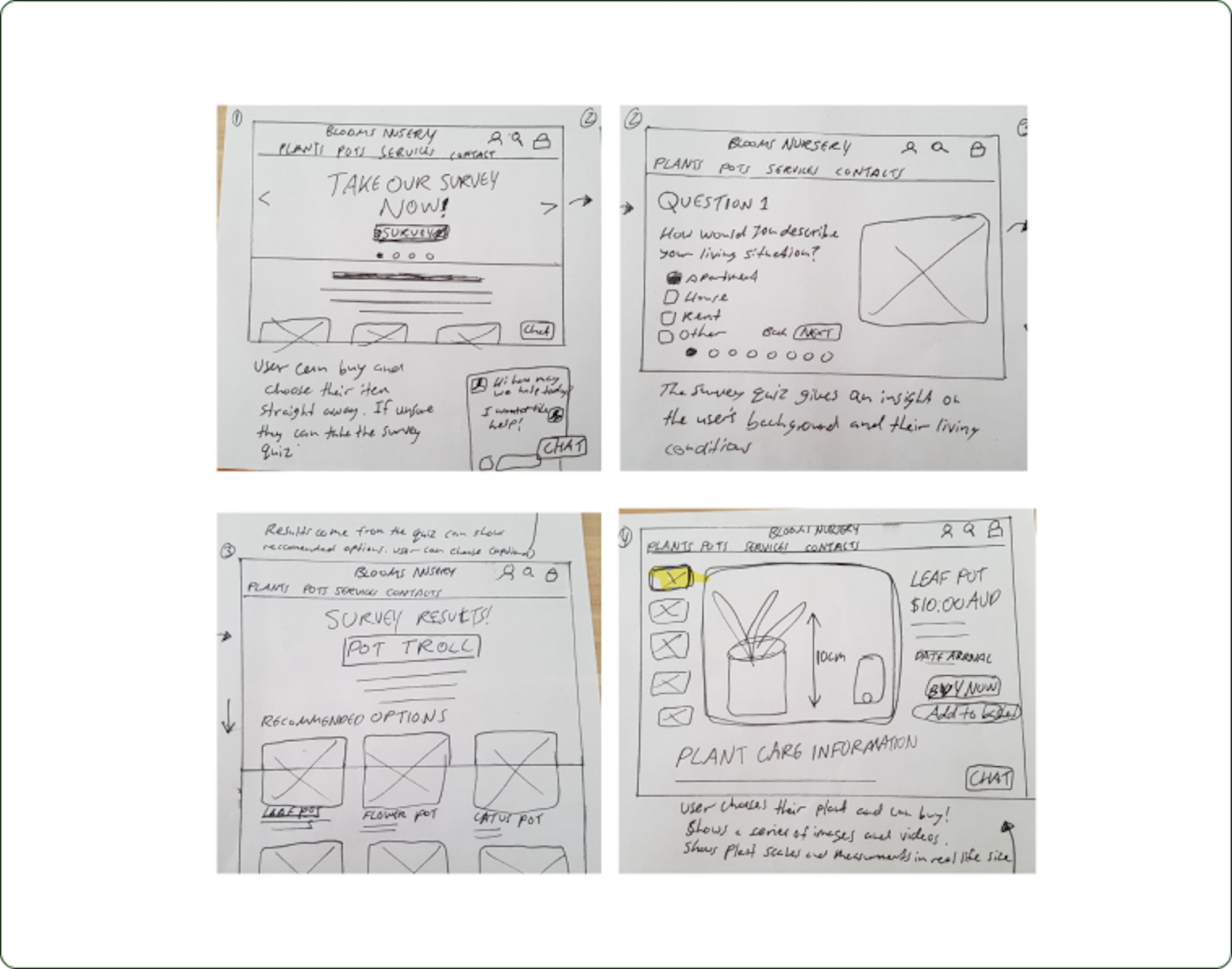
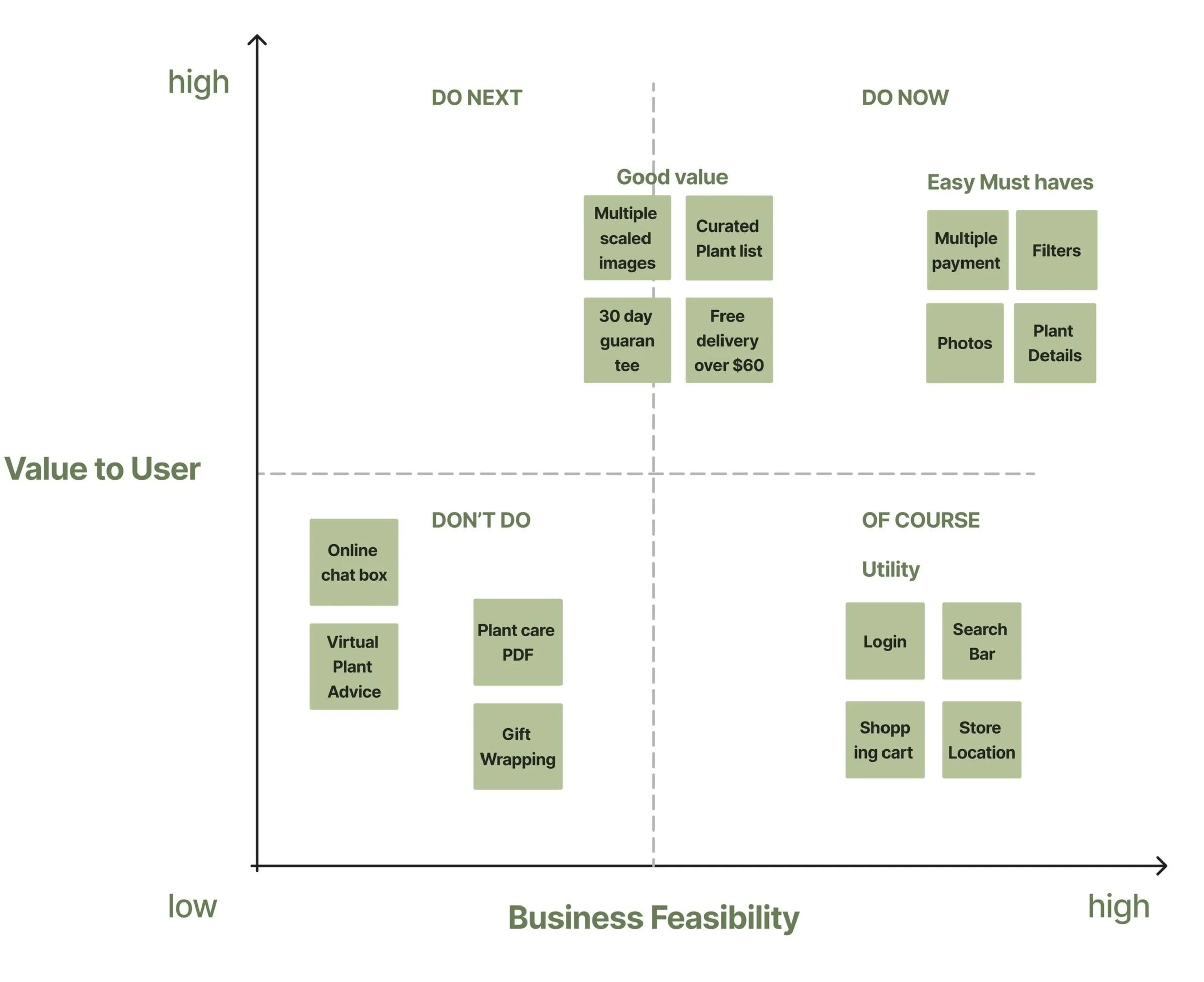
developing the MVP
Prioritising Features
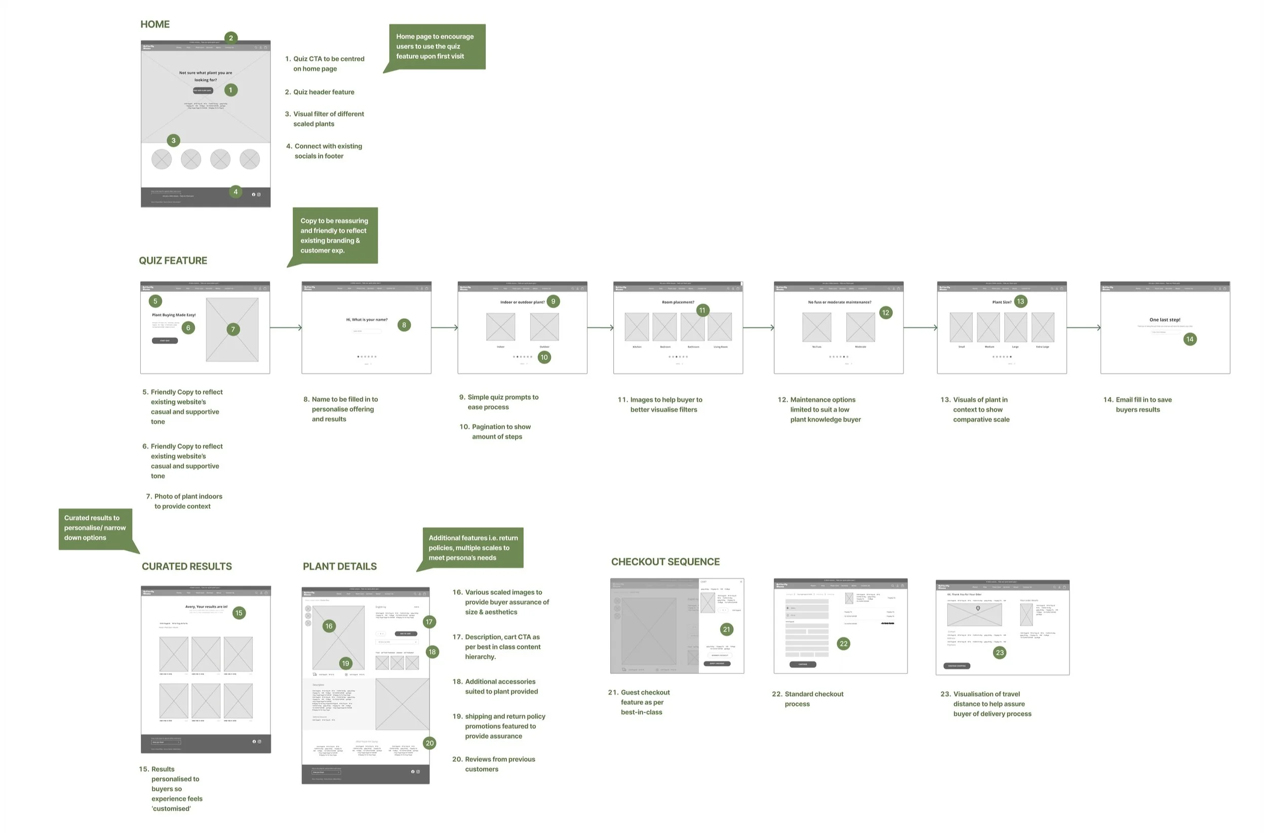
To determine what features to include in our MVP we mapped out features from our solution sketches onto a prioritisation matrix.
We included 4 additional features that focused around scale and visuals that were easy to implement, add value and support the primary quiz feature.
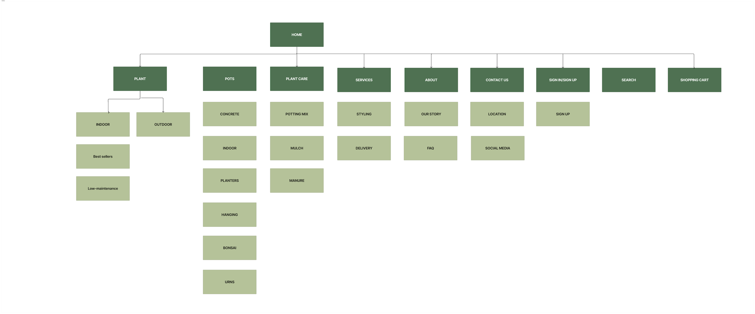
Removing jargon & simplifying the site navigation
To assess the effectiveness of the existing site navigation we conducted an open card sorting exercise with 5 users. Users reported feeling ‘confused’ and ‘unsure’ of the jargon used in the headings as well as where certain content would sit. Based on these findings we decided to simplify the copy of categories to reflect best in class before conducting a closed card sort.
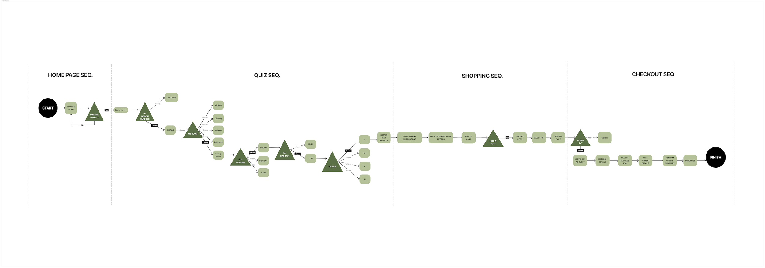
Designing the User Taskflow
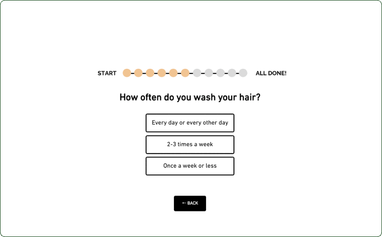
Based on our research findings we wanted the quiz to be short and punchy whilst still being able to deliver personalized & accurate results.
From this, our team mapped out 8 steps our user had to take to complete the task of finding a suitable plant.

PROTOTYPE & USABILITY TESTING
Testing 10 users validated our quiz feature... but there was room for improvement
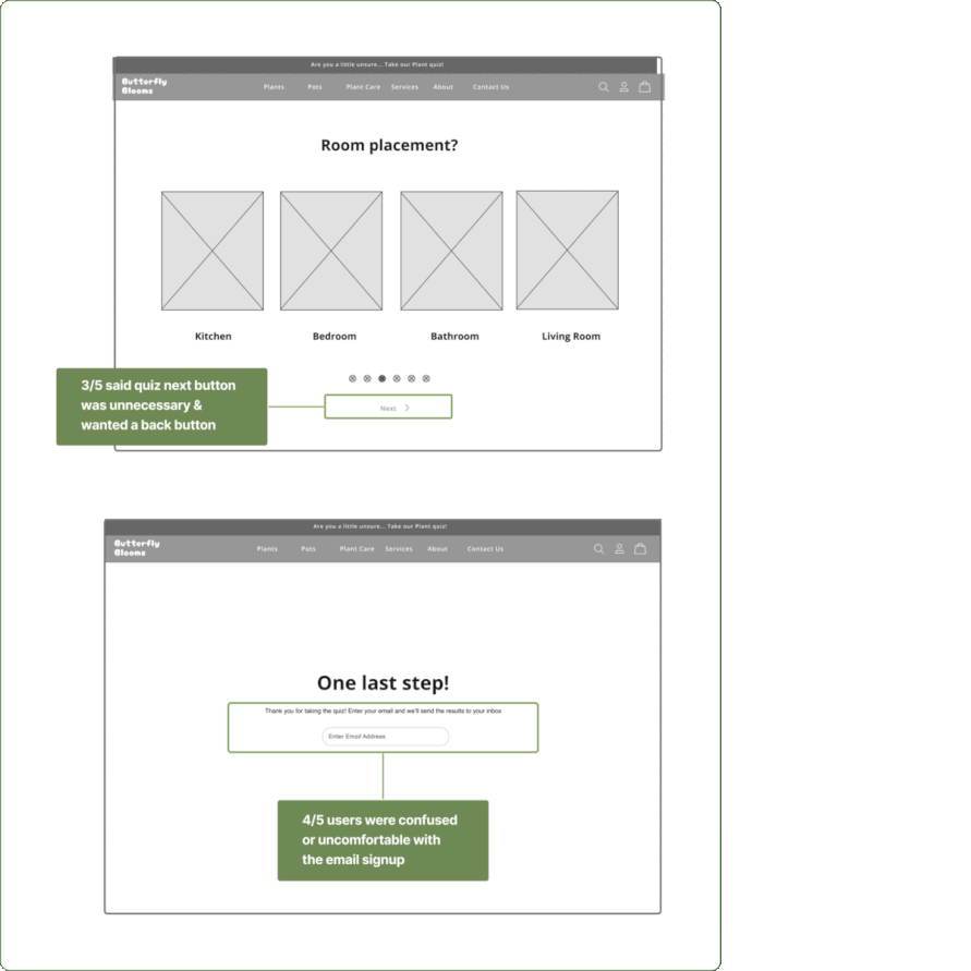
From our testing, 10/10 of our users successfully completed the quiz and checkout process. This helped validate our hypothesis that a quiz would be an effective shopping feature.
Aside from this, there were some minor hesitations surrounding content hierarchy, UI design and navigation as indicated in the slideshow.
“I expect quizzes to be long & cumbersome but this was short & simple"
Adjustments made as we moved into hi-fi:
automating the next question once users clicked on a prompt rather than having to click ‘next’
Removing email barrier to receive results.
improving content & call to action readability.
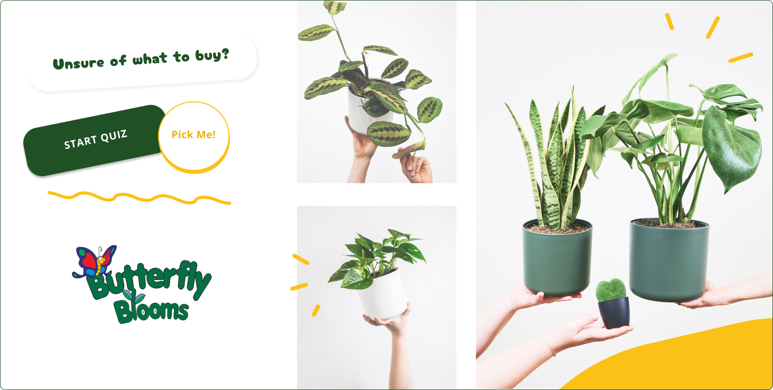
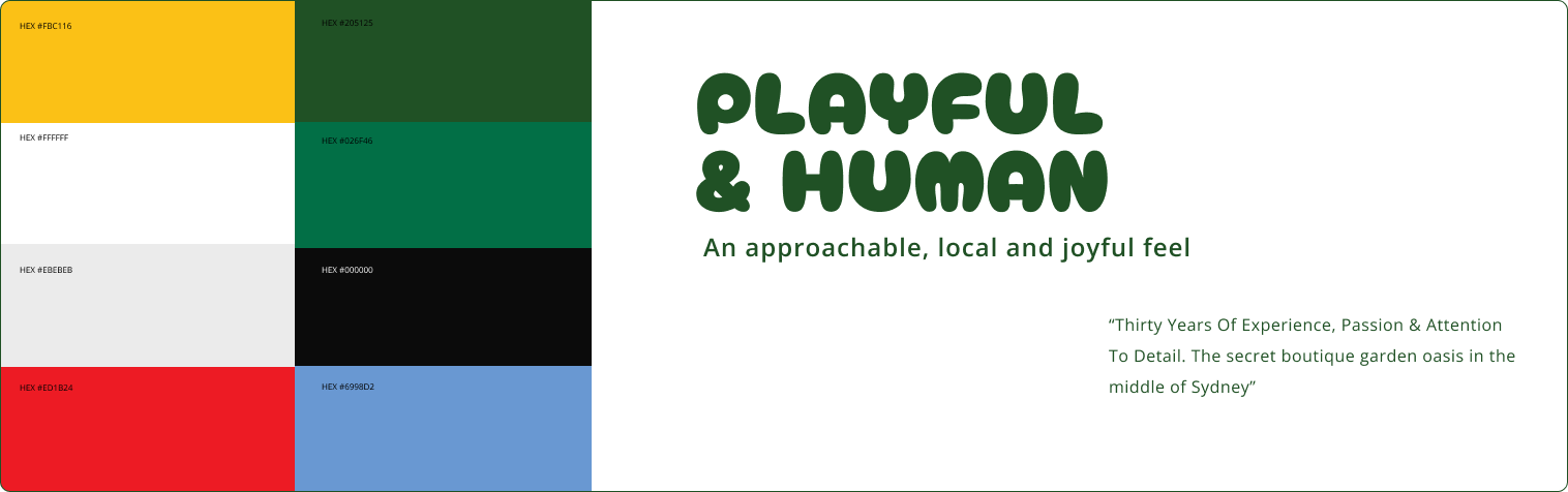
BRANDING & VISUAL DESIGN
aligning the new website with the existing brand
With over 30 years in the business, Butterfly Bloom’s has a strong local presence built on trust, passionate staff, and personable customer service.
The visual design of the new e-commerce site reflects those qualities whilst also paying homage to the friendly childlike nature of the existing website.
The brand is playful and joyful whilst being approachable and reassuring where appropriate.
LEARNINGS
Deceptively simple solutions are a result of rigorous testing
Overall being the first time our team has tackled an e-commerce project we found the process challenging but also rewarding. Going through the process of designing an e-commerce site helped our team appreciate the complexities and considerations that needed to be taken throughout the site and into the checkout flow.
My key takeaways were:
-
There were a number of points during the project where we didn’t know how to move forward. The temptation was to assume an answer/design for ourselves. When we did assume we found that we struggled to figure out how to move forward but when we fell back on our research it was much easier to prioritise how and what to design for.
-
There were times when we didn’t know what the outcome of the task would be or what we would action next but we soon realised that was sometimes the point. Bringing solutions in too early would skew the task and as a team we had to keep reminding each other to not project ideas into our task.
-
By having an ecommerce feature that was a little left of field, our idea needed to be grounded with clear supporting research. Whilst our persona helped drive the idea direction, there was room to present a stronger business case. This could have been done by presenting the value of the quiz through qualitative and quantitative measures.
Assess time spent for users to find said plant through traditional means vs quiz
Assess how user’s feel finding plant through regular means vs quiz
Provide more analysis on how we organised the Information architecture and content for the quiz to make it more ‘intuitive’ as people have different ideas (often negative) on questionares