
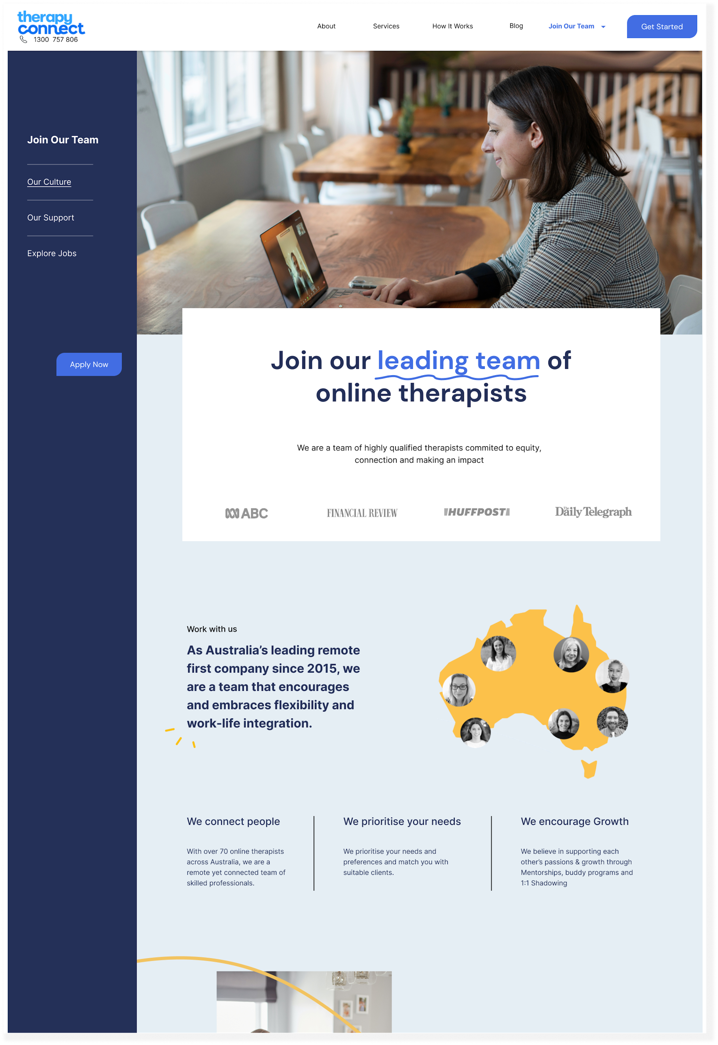
Supporting therapists through recruitment & onboarding
Role
Co-lead UX Designer
UX researcher
Team
Charlotte D
Lucy G
Timeline
1 month sprint
May 2023

OVERVIEW
Quality Healthcare is often limited to people living in rural and remote regions. Therapy Connect has been working hard to improve access to healthcare through online therapy for the last 8 years and they are now the leading NDIS online therapy provider in Australia.
However, with long patient waiting lists and plans to scale, Therapy Connect is struggling to recruit quality therapists to keep up with demand. They have also found their existing applicant onboarding process highly administrative and inefficient to manage.
SOLUTION
Working with the client team we investigated and mapped out Therapy Connect’s recruitment and onboarding journey for therapists in order to identify the main pain points and potential gains.
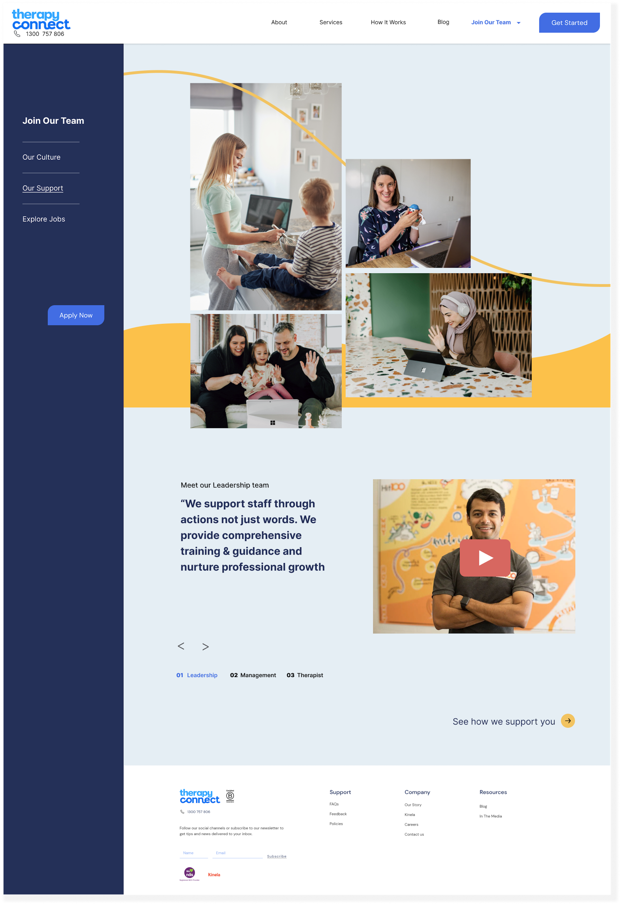
Our solution is an updated employee web page that provides transparency around company culture and the process of recruitment & onboarding. Designed as the first stage of a 3 part strategy, our focus is to first support applicants at their earliest pain point and help them feel valued even before they begin the recruitment & onboarding journey.
KEY CHALLENGES & CONSTRAINTS
There are supply constraints around recruiting and retaining quality staff.
The onboarding process is personalized, manual, and high touch, which, while appreciated by candidates - required heavy admin work and was not scalable.
As they were funded by the NDIS, they had a limited budget and as a result, have offshored their IT support & development.
OUR RESEARCH & DESIGN PROCESS
Archetype
Ideating
Prototype & Testing
Visual Design & Branding
User Interviews
Market Research
User Journey Map
Iterate & next steps
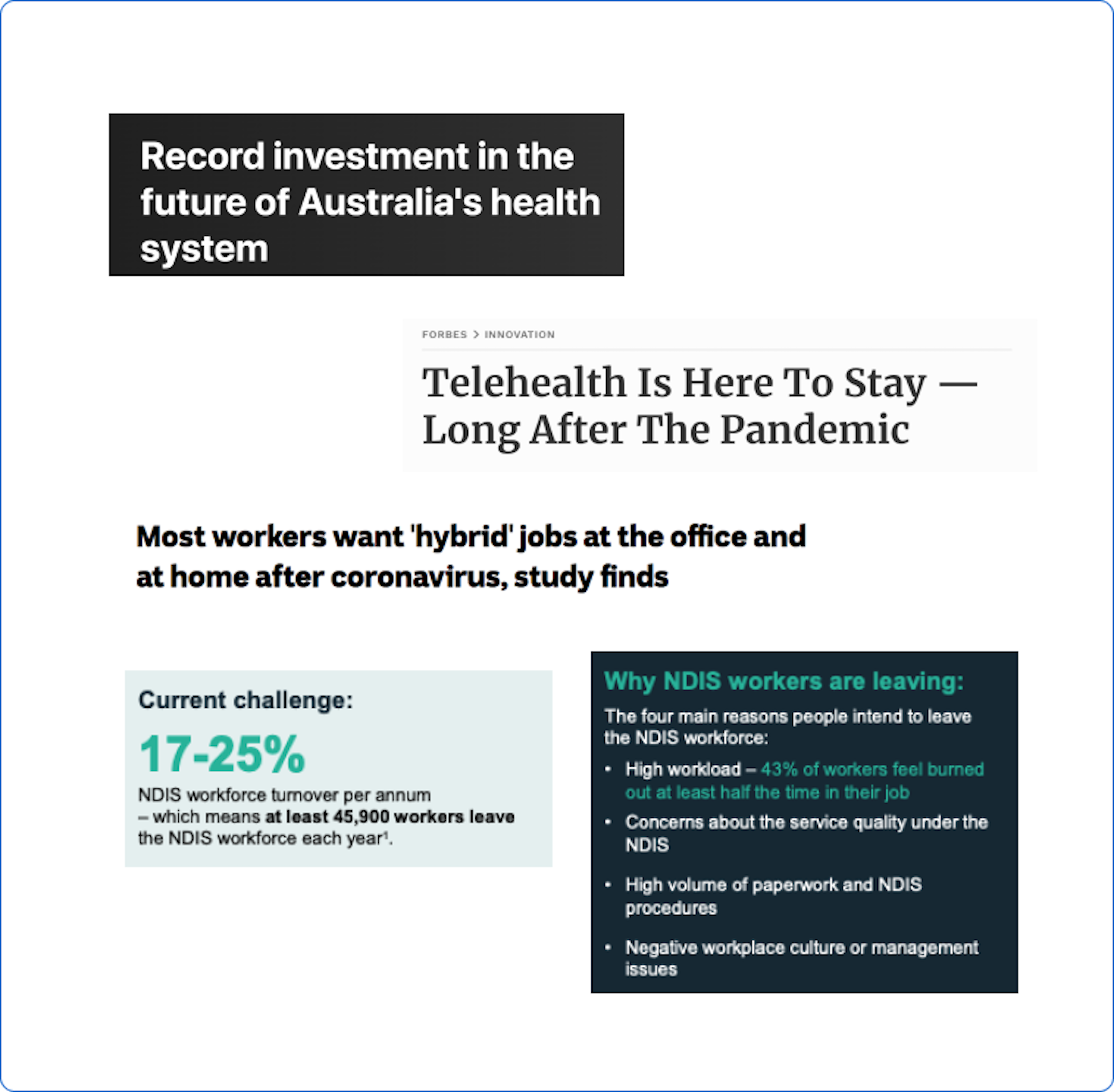
MARKET TRENDS
Let’s first investigate employment trends
With a significant gap in knowledge surrounding the intricacies of recruitment and onboarding, our team dived into market research to gain a more holistic understanding of the Allied Health space.
We found:
There was a concerning decline in the number of therapists actively practicing in the field.
NDIS was facing high turnover rates and staff shortages (17-25% staff turnover every year)
Since COVID, there were increasing demands for flexible work.
It was an increasingly competitive market for skilled workers.
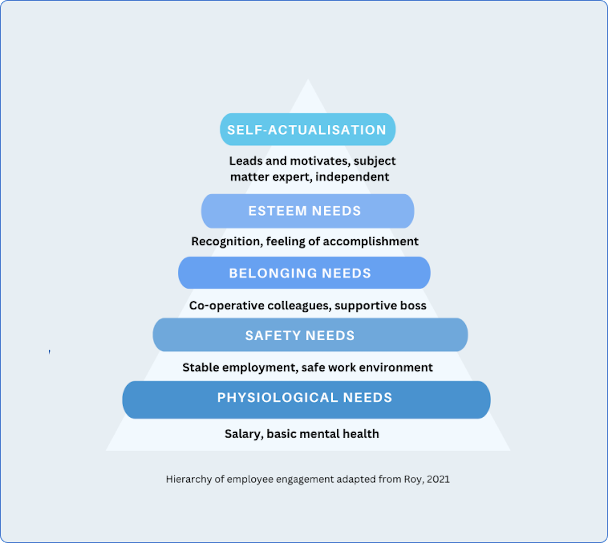
ACADEMIC STUDIES
Getting onboarding ‘right’ through structure, cultivating connection & belonging is key to employee retention
With our research giving us deeper insight into our client’s concerns around staff supply shortages, we looked to understand what role onboarding had in staff retention.
We found that:
Applying Maslow’s hierarchy of needs in practice helped companies more successfully motivate, recruit, and retain staff long term.
Cultivating a ‘sense of belonging’ through peer connection and staff support early on improved staff retention rates.
Having a structured & clear onboarding reduced attrition by mitigating stress and information overload in the early stages.
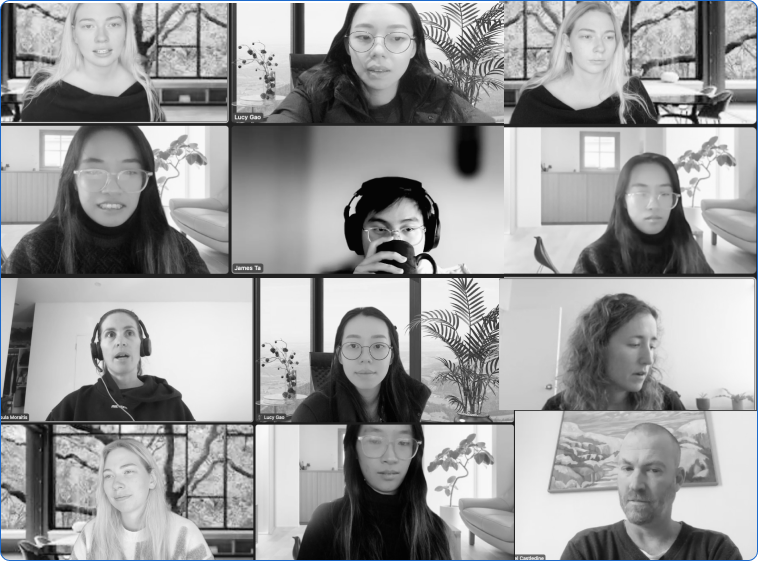
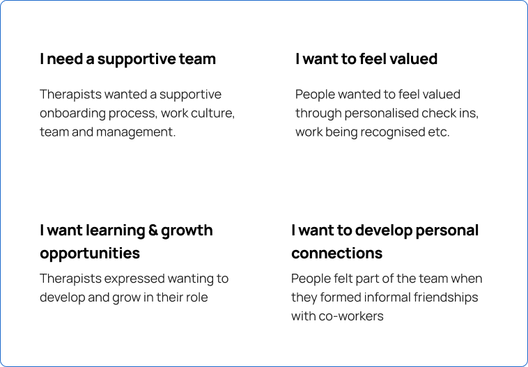
USER INTERVIEWS
Interviewing 23 allied health & 21 non-allied health employees over zoom & call
To ground our secondary research, we interviewed potential employees to better understand their experiences & expectations during recruitment & onboarding asking questions like:
“What was your previous role? Why did you switch?”
“Could you walk me through your last onboarding experience?
“When did you feel a part of the company, Why?”
Synthesizing these findings through affinity mapping, analyzing, and categorizing insights helped us identify the main needs, wants & frustrations people experienced.
Our interviews revealed 4 key findings
ARCHETYPE
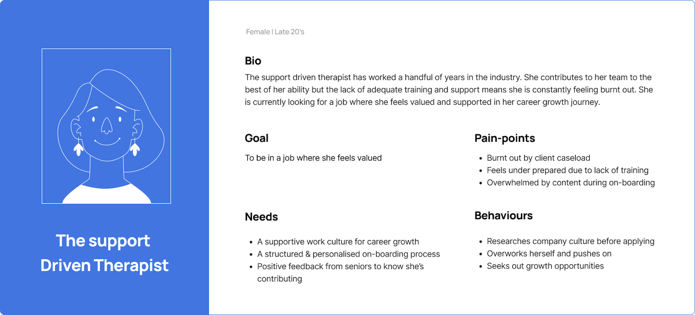
Introducing the Support-Driven Therapist
Our insights helped us develop an Archetype: The Support Driven Therapist. Burnt out due to a lack of adequate training, she is looking to be in a role where she feels valued.
PROBLEM STATEMENT
The support-driven therapist who is burnt out needs an encouraging work culture where she feels valued
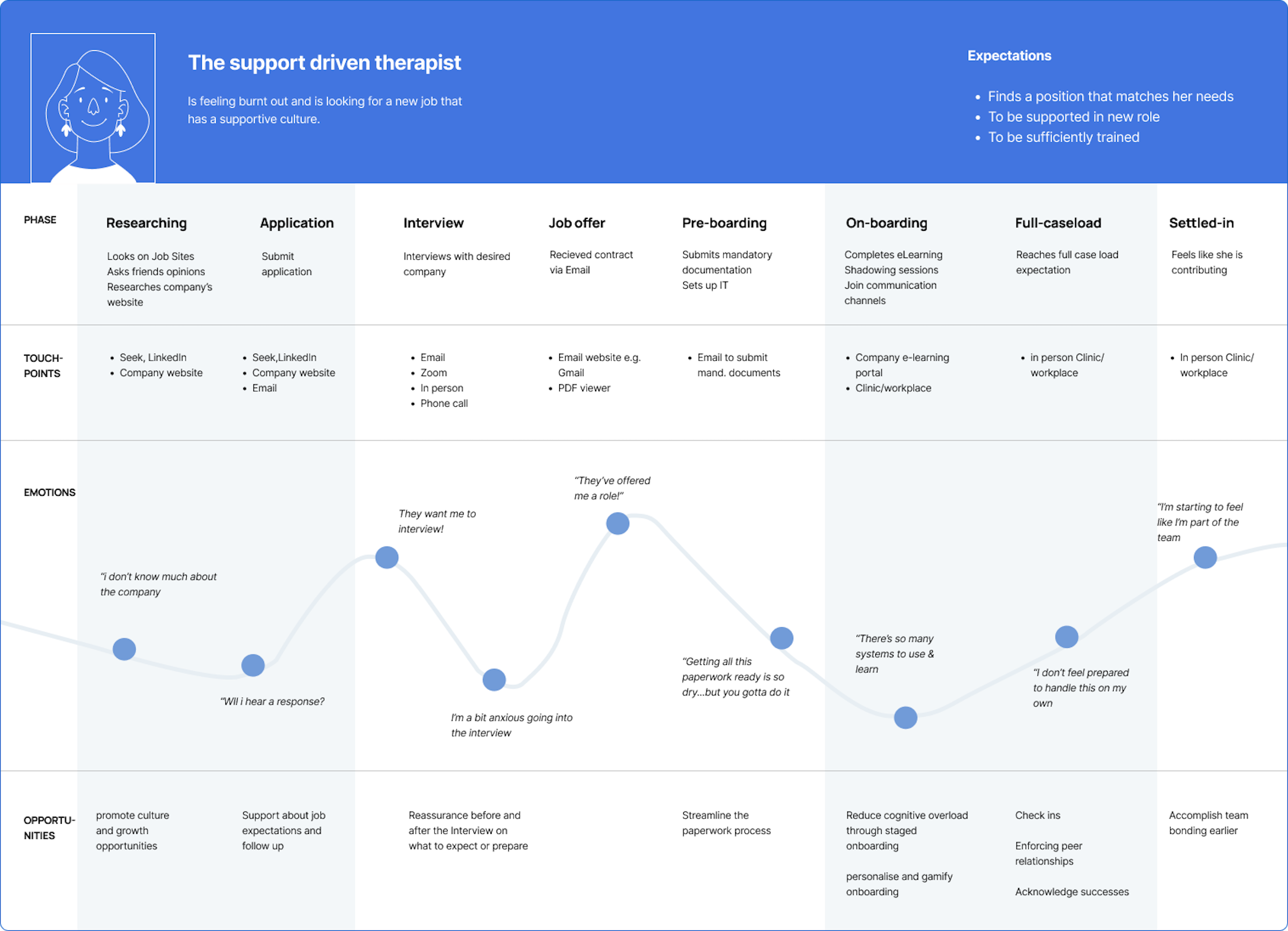
JOURNEY MAP
Developing a user journey map helped identify 2 possible areas to intervene:
early application & late onboarding
IDEATE | REFRAMING THE PROBLEM
How might we show supportive work culture? how might we show she is valued?
With these two pain point areas of the user journey in mind, we ran a series of ideation workshops and found 3 recurring design solutions.
However, as our ideas tackled different parts of the recruitment & onboarding process, our team also had differing opinions on which idea would be ‘most valuable’, ‘impressive’, and ‘impactful’ to develop.
Tackling recruitment would help onboard more staff but place a larger burden on an already cumbersome administration process.
Tackling onboarding would improve administration but we were unsure if this was an effective use of time & budget without first addressing recruitment supply issues.
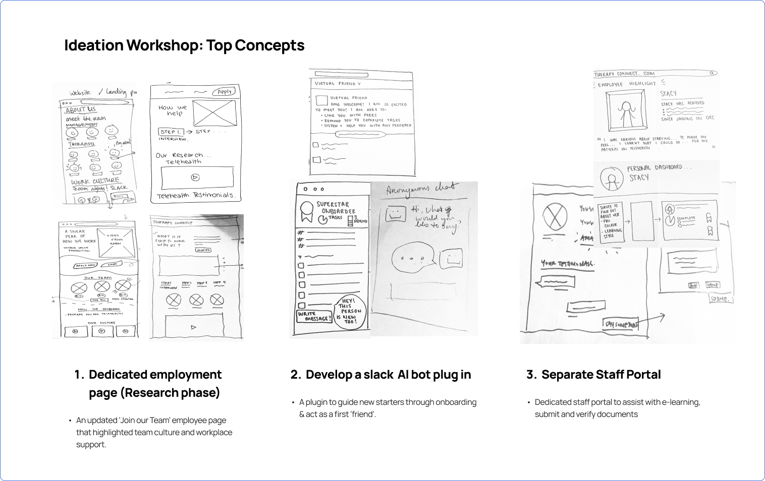
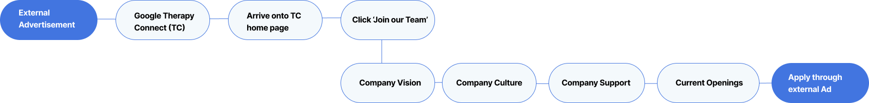
After some debate, we assessed a redeveloped ‘Join our Team’ page would be the most feasible to implement
Based on the criteria of feasibility, impact & value we assessed:
Updated ‘join our team’ page: Whilst not the most ‘grandiose’ idea, this was the most feasible based on IT, time & budget constraints
Slack Plugin AI Bot: Whilst effective in reducing administration, subscription services already existed and could be readily implemented. I.e. Chat Bot, Zavvy, etc.
All-in-one employee Portal: Whilst it would streamline administration around new employees, It was not feasible to develop for a company still in its early stages.
WINNING IDEA
A re-developed ‘join our team’ webpage where people felt supported and valued even before applying
We hypothesized: Optimizing the ‘Join our Team’ webpage so that it highlighted company culture, employee benefits & provided transparency around recruitment & onboarding would contrast with the convoluted and opaque processes healthcare workers typically reported experiencing during application. By extending the sense of “support” people received earlier, potential applicants would feel reassured and even excited about joining Therapy Connect.
THE EXISTING WEBPAGE
Testing the existing ‘Join our Team’ web page with 5 people revealed that users were unengaged with the content
To assess the validity of developing our idea, we tested the existing page to identify key pain points and opportunity areas to address in our MVP.
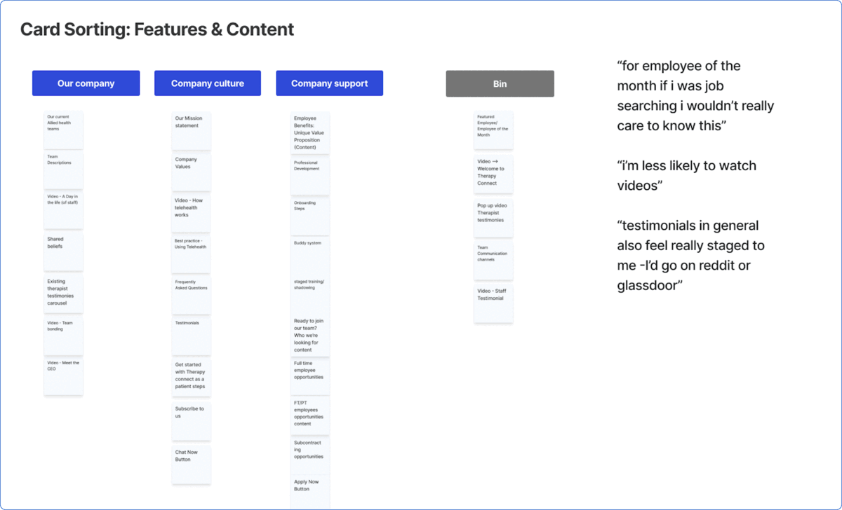
“They seem friendly, but I can’t get a gauge of what it’d actually be like to work there…there’s a lot of saying but not showing”
We found:
4/5 users clicked through the about us page before arriving to the ‘join our team’ page
There was a 60% average scroll depth
5/5 Users skimmed content & skipped videos
4/5 Users were confused about applicant vs patient content.
3/5 users expressed repeated Apply Now buttons felt ‘pushy’
Analyzing comparative employment websites for best practices
With key areas to improve on in mind, we looked to comparative employment pages (Spotify, Airbnb, Hot-jar & Google) to identify and translate best practices for content hierarchy and visual design into our MVP.
Our research identified that content was often made digestible through carousels, accordions, icons
Headings & copy were action-driven, concise, and often written in 1st person.
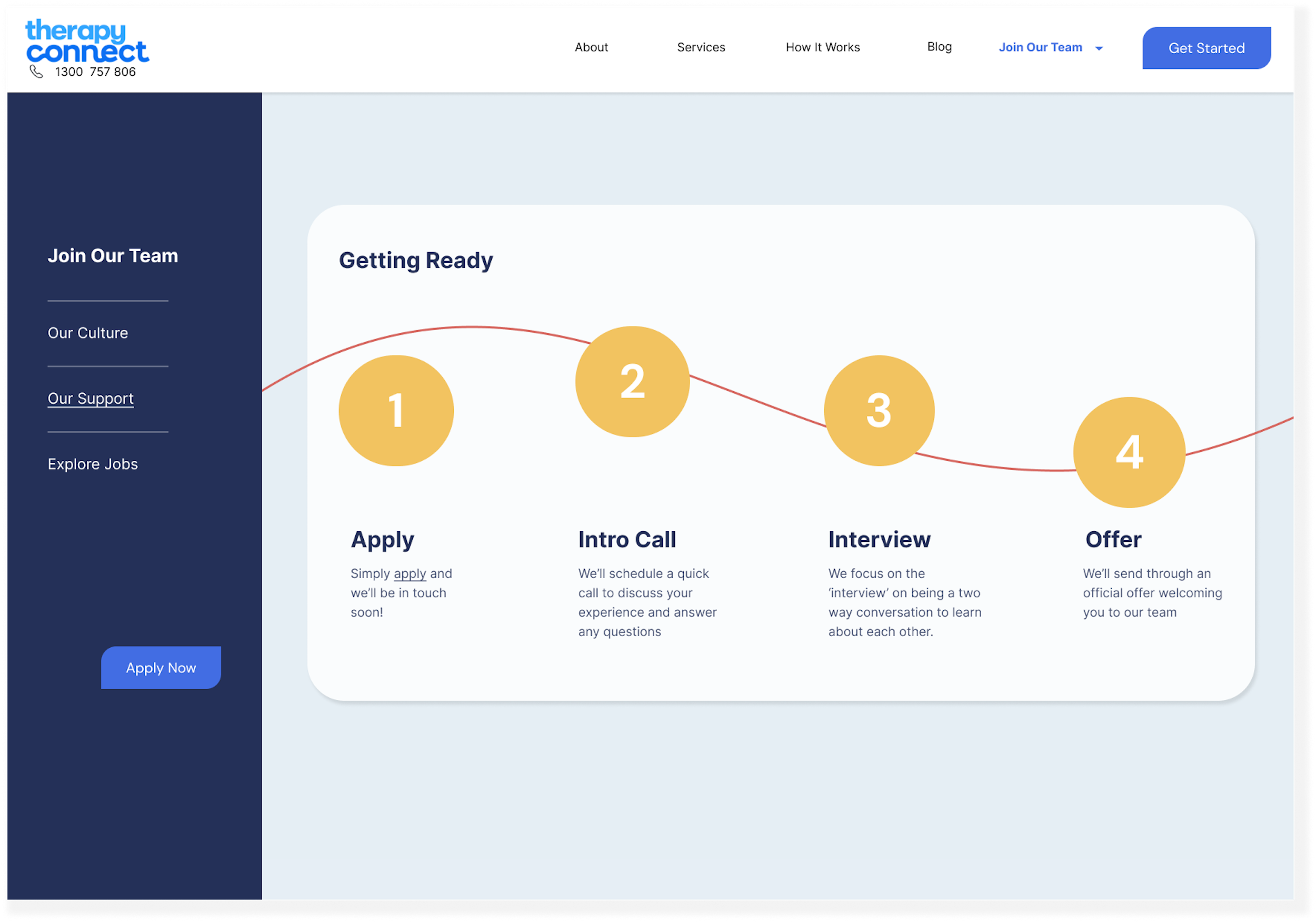
Where recruitment processes were shown - they were broken down into easy-to-follow steps.
Developing the MVP
A desktop first solution
To determine platform to focus our design efforts, we looked back to our research to understand how people looked for & applied for jobs.
We found 80% of people would job search on their desktop website as it was easier to research and apply on a larger screen.
A task flow focused on education & content engagement
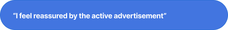
Our research showed us people felt reassured by the active SEEK job ad and would return there to apply after researching the company website.
Due to budget and time constraints we decided to not focus on converting this behaviour. Instead, the goal of our solution would be to better educate and engaging quality leads before they applied.
We mapped the steps & key content our archetype would engage with to feel 'supported & valued’.
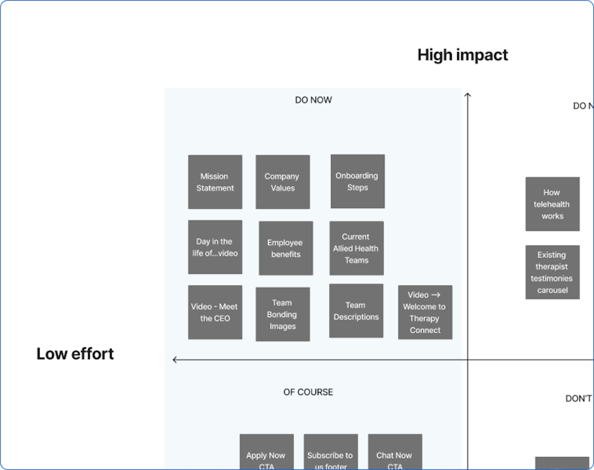
Prioritising features for user value & feasibility
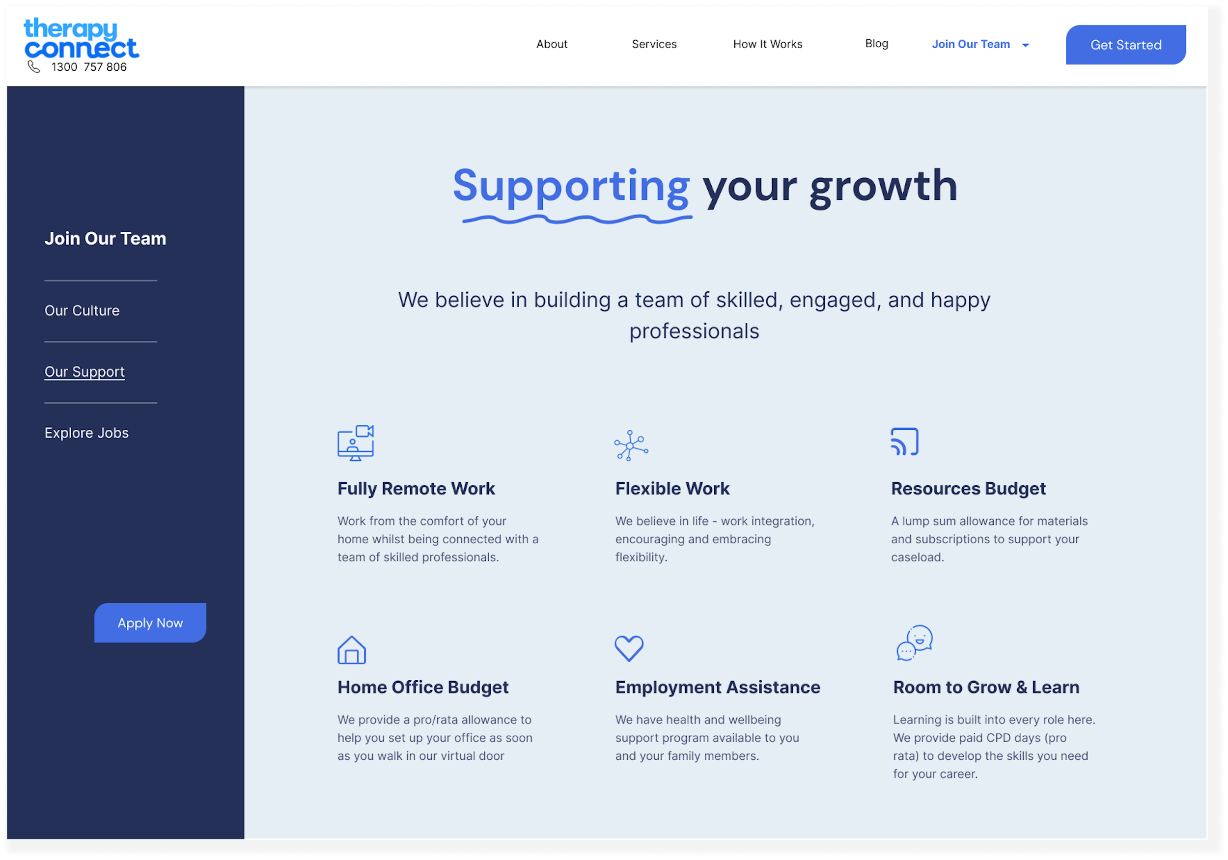
To determine what features to include in our MVP we prioritized them according to what would add the most value to our support-driven therapist but low effort to implement. These key feature included, employee benefits, company culture content, onboarding & recruitment steps.
Content Hierarchy
To identify how to organize the content as well as what headings to organize content under we conducted a series of card-sorting exercises with 5 users.
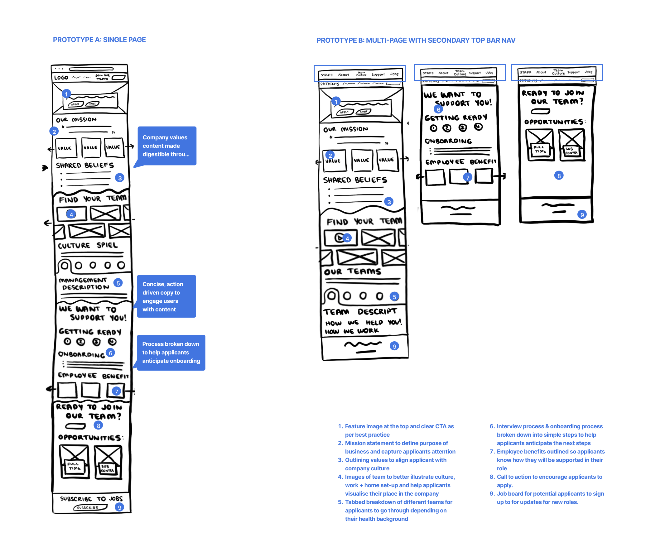
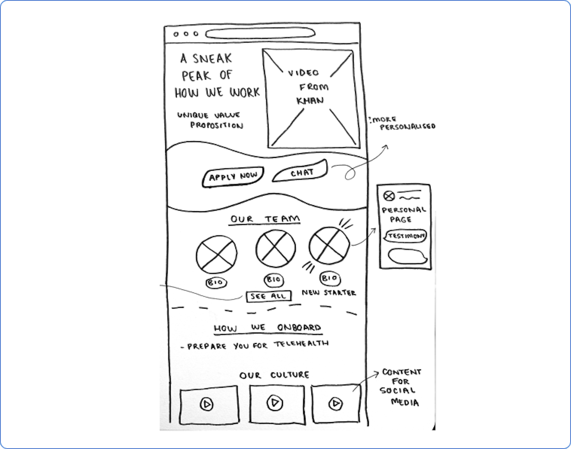
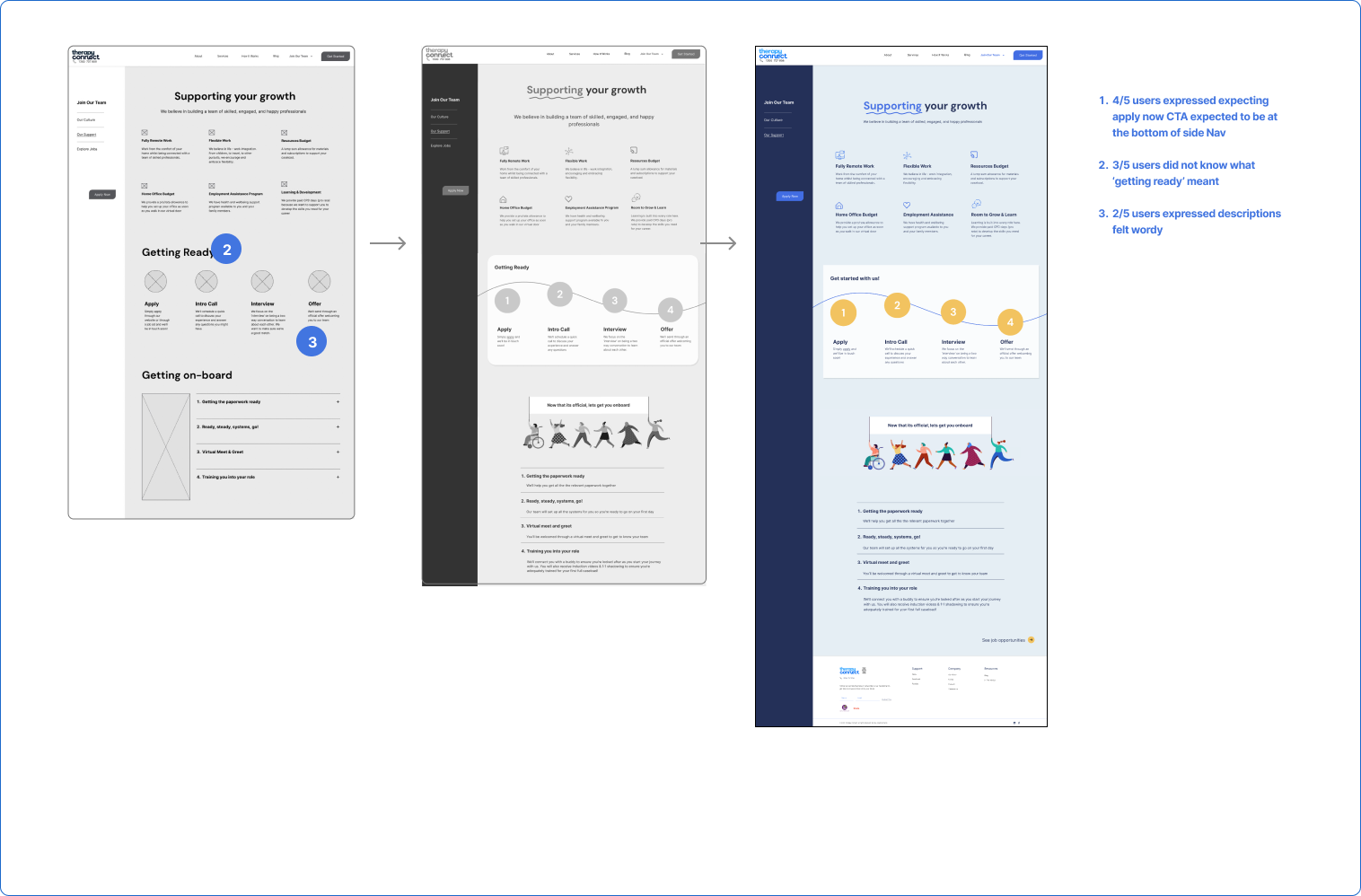
LOW-FI DEVELOPMENT & TESTING
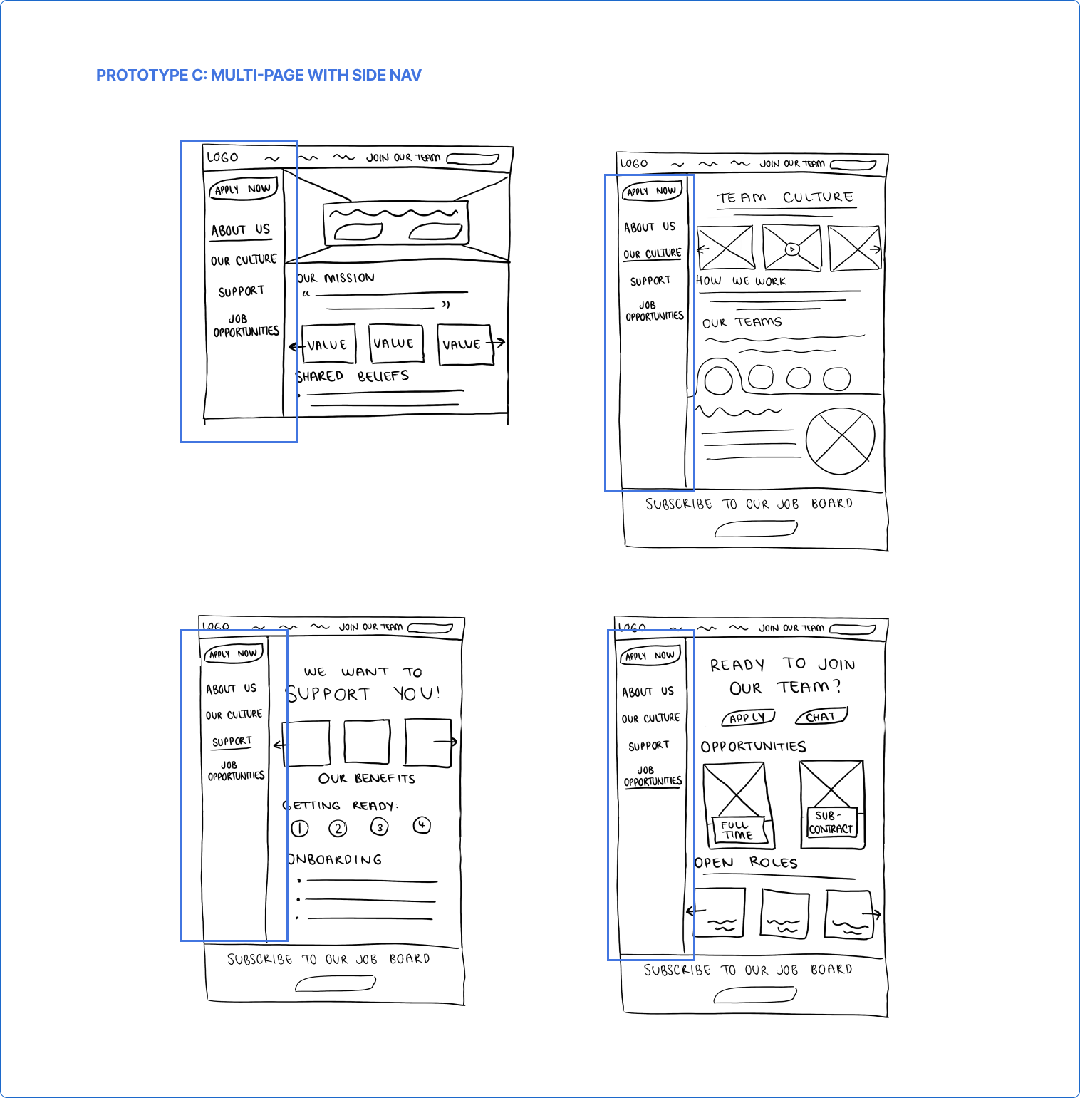
A/B Testing with 5 users for content hierarchy and navigation directed us to a multipage design with a side navigation
From our testing, it was clear people were more engaged with content when it was spread out on multiple pages vs a single scroll page. Regarding navigation, user hesitancy around a secondary top nav eventually led us to a fixed side navigation menu.
Whilst we had confirmed the navigation, it was clear from testing that the content structure and some features needed to be reconsidered. We found that as we sketched, features were being added that had previously not been agreed to and after discussion, did not add the most value to the user.
Adjustments made moving into mid-fi:
Remove our About Us page - there was already an ‘About Us page featured in the existing nav. People consistently visited this page first and were then confused and overwhelmed by the double-up of info.
Remove the job board feature
Consolidate ‘shared beliefs’ content with ‘our values’
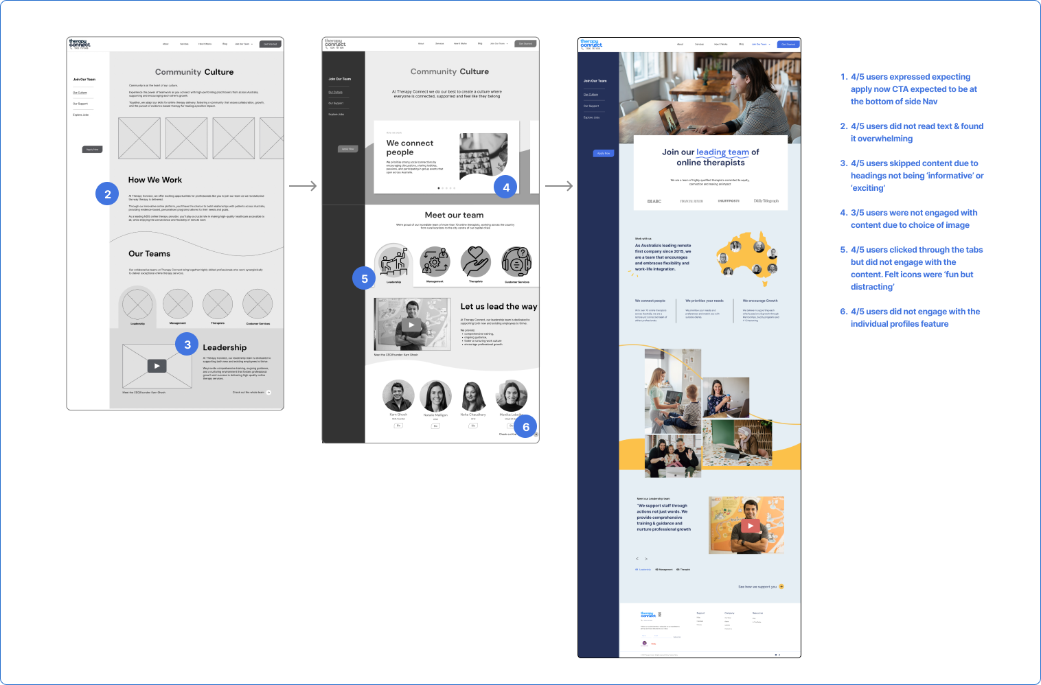
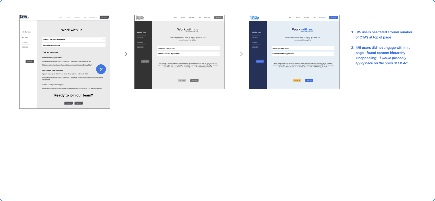
MID-FI TESTING & DEVELOPMENT
Testing with another 5 users revealed people were engaged with the interactive features but less with the content
From our testing, whilst the scroll depth improved, users still skimmed through much of the copy and where there was interactive content - they were often more focused on the interaction than the actual content body.
As we looked to develop our hi-fi prototype, I raised again, there were features that had been added that did not add value to the user’s main need ‘to feel valued’.
It was clear that we needed to:
Strip our solution back to our agreed MVP features
Reevaluate the hierarchy of text & the visual design of content.
Re-evaluate the inclusion of interactive features ‘for the sake of’ and focus more on improving the ux experience of content and copy
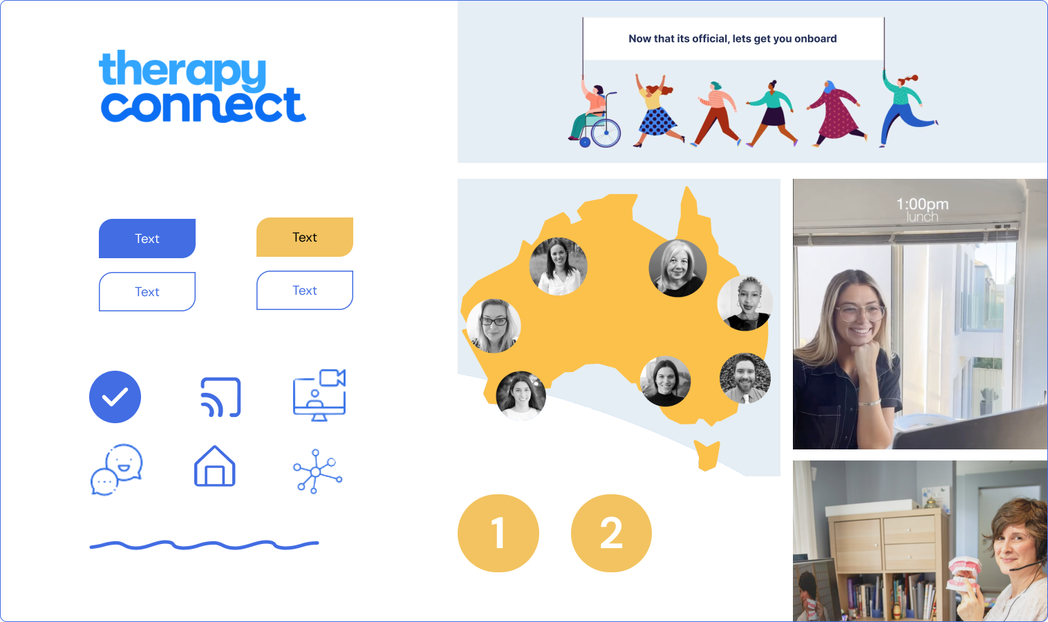
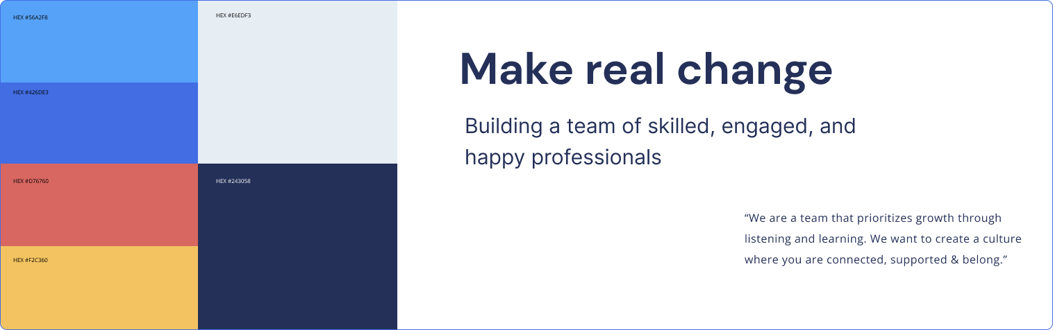
VISUAL DESIGN
A design system that followed the existing brand guidelines…with a slight shift
We developed a simple design system to help stream-line the development of our prototype. With a recent company rebrand, it was important to use the same colors, fonts, and design language to ensure consistency and a seamless website experience.
However, to help applicants identify they were on the employee dedicated page we increased the percentage of the dark blue (#243058), using it for the anchored side nav. This was to address insights gleaned through usability testing the existing site
“I can’t tell when content is directed to patients vs staff”
A HAPPY CLIENT
“They delivered a fantastic project. We gave a broad remit for what was a short time-bound project & Jessica & her colleagues were able to work collaboratively to analyze & determine a high-value outcome. They asked well-considered questions, sought input, and communicated extraordinarily well…They had come up with well-researched output and very achievable actions for us to progress.”
Desleigh White (HR lead)
We tested our final prototype with 6 users and achieved:
90% scroll depth on each page
80% increase in content click-through rate
95% users expressed they would return to the original ad to apply
LEARNINGS
Find the problem, not the solution
Tasked with such a broad space to research, we were initially unsure of how and what to tackle. With so many variables and possible problem spaces to investigate the temptation was to have a solution dictate our research and design process. We were constantly reminded to allow our the process guide us, assessing each step against our archetype’s needs, business needs and constraints.
My key takeaways were:
-
As we developed each prototype, I found there were new features being snuck in! This meant as a design team we were working to develop features that whilst potentially nice to have but did not add the most value to our users at this point. The reminder here is to consistently refer to our archtype, problem statement & in this case feature prioritization exercises.
-
There was a push to propose a ‘grander’ idea. Having a background in project management helped me ground my decision to push against this momentum and propose a more objective criteria to measure our ideas against and ground our decisions.
Having the client appreciate the fact we respected their budget and tech constraints was the cherry on top.
-
There were times when our usability testing produced unexpected results. Rather than designing against/ignoring these behaviors (which proved futile) we eventually embraced the feedback and adjusted our design accordingly